There's more to Mailplane's Dark Mode than you think
When I joined Mailplane as a designer nearly a year ago, it was my job to redesign the complete user interface for version 4. With the release of macOS Mojave, I had the pleasure to expand the UI with a dark theme. Now, I am happy to provide you with some insight into the design process and its challenges.
Creating a dark mode
The first step, before designing anything, was to become familiar with Mojave’s dark mode and distinguish between native and non-native parts of Mailplane. This was important, as native parts darken their appearance automatically in Mojave’s dark mode, while non-native parts don’t. By doing this, I could get a proper overview of which parts I simply had to monitor as they darken and which parts I needed to adjust manually from light to dark. With this knowledge, I was ready to start designing.
Setting the mood for the design process
One of the first designs I created was the night sky scenery within the onboarding and tab management screens. This might not be the most urgent part of the app to start with but it was the part I was most eager to try out. The idea of a night sky was not new – it had already come to me during the initial redesign process. Back then, I had an idea similar to Apple’s, which features a dynamic screen background in Mojave. I imagined we could change the background between a daytime and a nighttime scene in real time. In the end, the idea didn’t make it into Mailplane in favour of efficiency.
For dark mode, on the other hand, a night sky scenery felt fitting, and I really loved the results after trying it out. It gave me the motivation to really delve into the project.
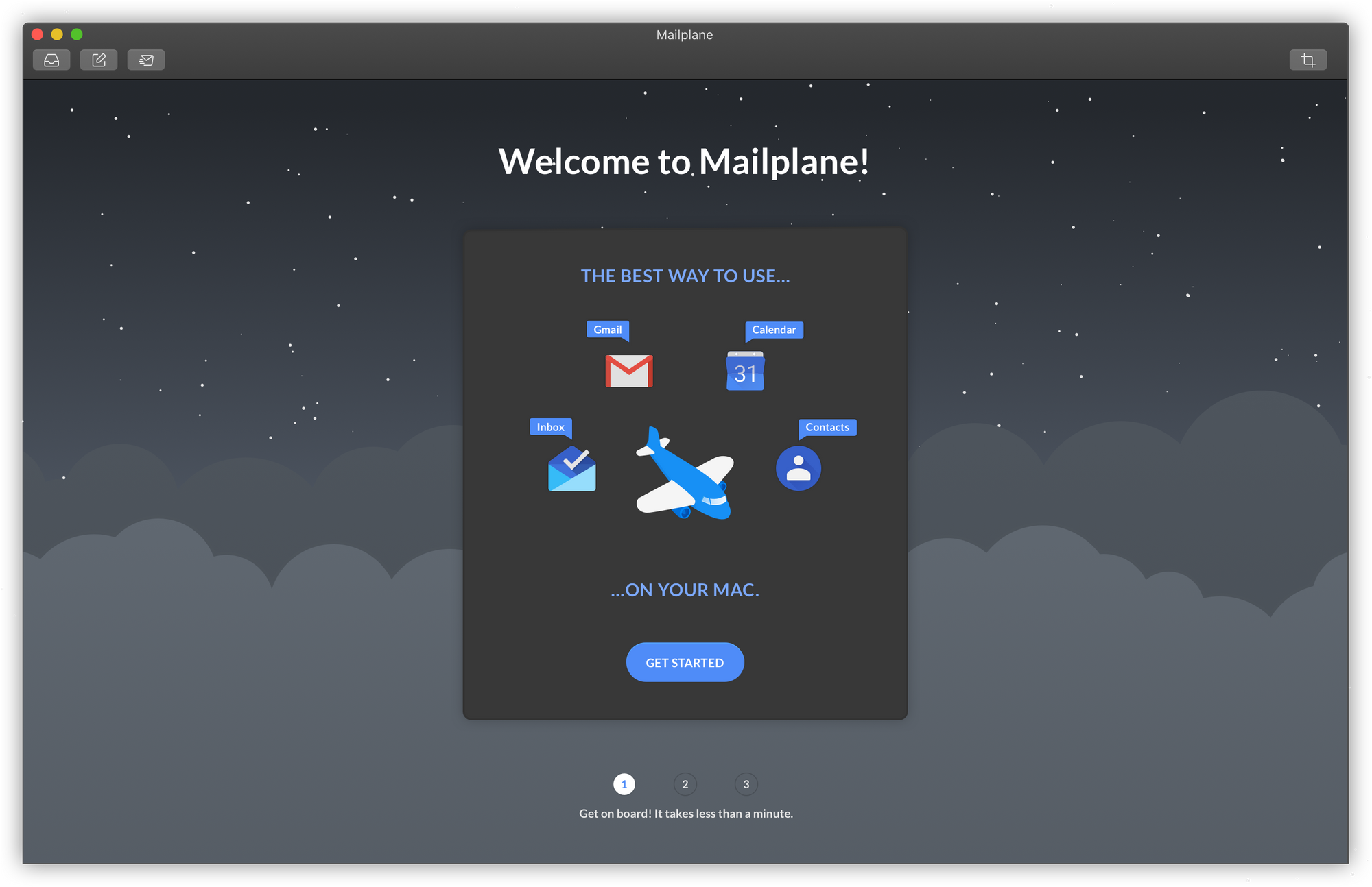 New night sky scenery in dark mode
Dark mode and its peculiarities
Dark interfaces are not just inverted WWDC 2018 - Session 210 - macOS
While working on the UI, I discovered that Mojave’s dark mode has quite a few peculiarities to it. At first glance, it appears that dark mode “just” converts all light backgrounds and UI components to dark greys, while dark elements like text or icons become light-coloured. However, that’s not entirely true – there are a few special cases.
One of them affects how icons appear when switching from light to dark. In light mode, we use outline-styled icons which work very well in that mode. However, when switching to dark mode, some of them begin to look ghostly, or hollow, and can become hard to read. This has to do with the way we are used to reading images: on a light background, it is natural to read the empty space of an icon as it’s volume or shape; if we place icons on a dark background, though, this sense of volume and shape can get lost.
 Light version of toolbar icons
To give icons in dark mode a sense of shape and volume back, I changed their look from an outline styling to a solid styling. With this new appearance, the icons became recognisable again. And if things still felt a bit off, it helped to tweak a little here and there, like adding or removing lines or details.
 Iterations on toolbar icons for dark mode
Solutions for Mailplane-specific UI elements
While I could rely on Mojave’s dark mode as a template for non-native components, there were a few Mailplane-specific cases were a customised solution was necessary. One of those was the selection of colours we offer to colour-code different accounts. Those colours are important when using Mailplane for the first time, opening a new tab or adjusting account settings in the preferences. On light backgrounds, account colours are well-visible and high-contrast but, on a dark background, a few problems appeared.
1. The colour Blueberry, a dark purple, was too low-contrast against dark backgrounds.
2. Small, coloured text (e.g. colour name captions) became hard to read.
3. Tab management buttons were low-contrast and became hard to distinguish from each other.
After testing out a few ideas to solve problem number one, I came to the conclusion that adjusting the Blueberry colour was the most promising solution. This also meant that it would be best to replace the colour in both states, light and dark. Having two versions of the “same” colour could create confusion and, on top of that, it would have made implementation more complicated. To avoid this, I created a replacement that was brighter and shinier while also trying not to diverge too much from the initial colour, as that one was already in use.
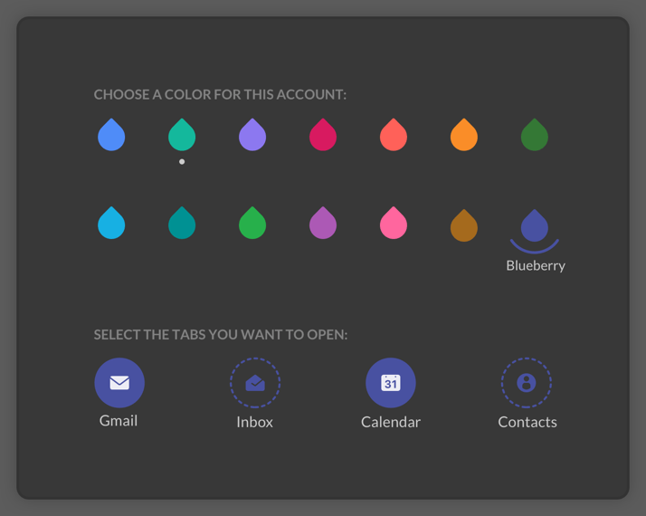 Colour adjustment: old dull vs. new bright blueberry colour
For problem number two, I decided to forgo colouring small text in dark mode altogether. Having coloured text was less important than legibility, so I defined a neutral light grey for all small texts sizes.
Problem number three – distinguishing tab management buttons – took a few iterations to determine the best solution. The goal was to find a solution that made the colour more prominent. In contrast to problem number two, colour is important here, as it helps users to distinguish instantly between different accounts. Changing the background of the button from dark to the corresponding account colour worked best. Now, accounts can be easily distinguished by their colour at a glance.
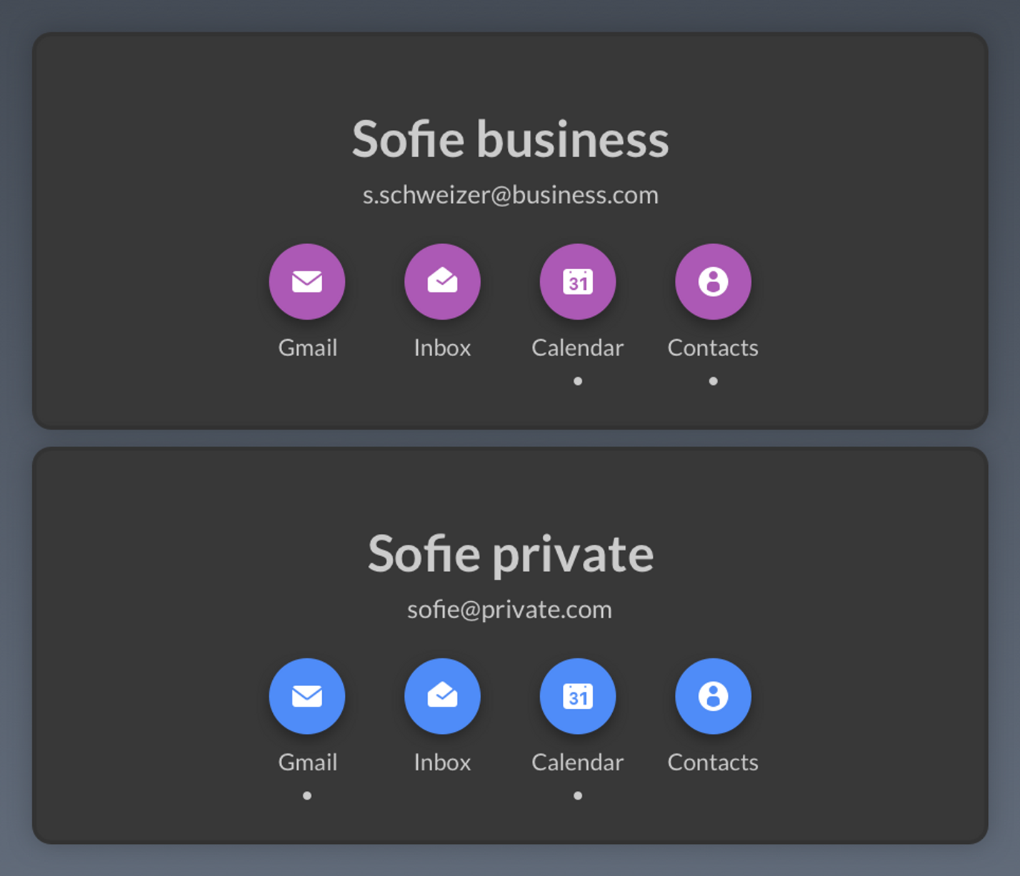 Account colour-coded buttons and light grey colour for button captions
Mailplane’s character icons
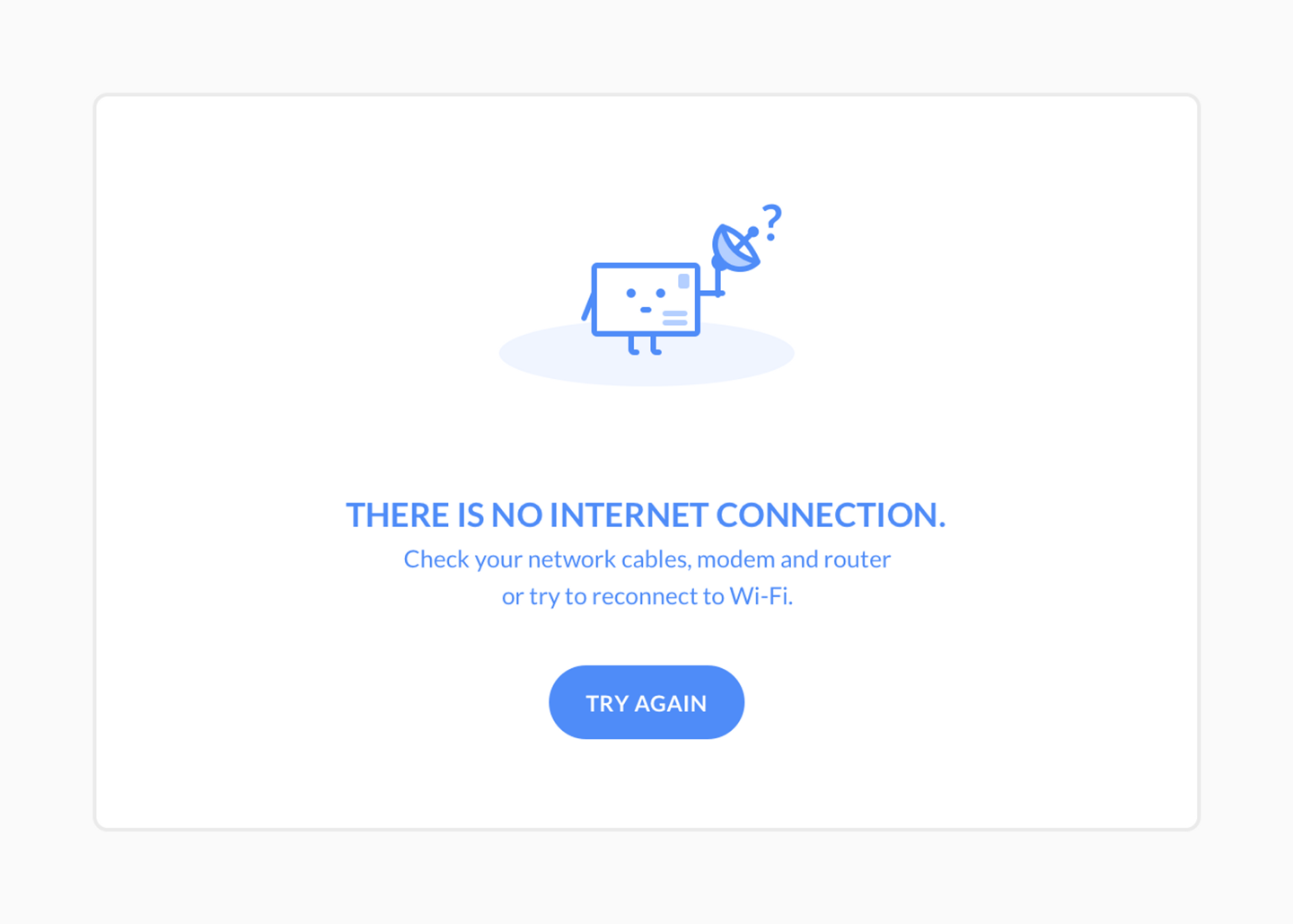
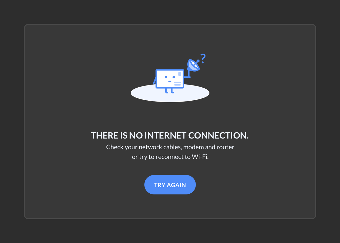
While most of Mailplane’s UI worked quite well in Mojave’s dark version, Mailplane’s character icons were troublemakers. Originally designed for a white background, they didn’t adapt well to a dark one. Although still well-visible, they somehow looked odd.
 Light mode version
 First dark mode version
First, I tried a workaround. I added a white shape as an additional background element so the icon wouldn’t lie directly on the dark background. However, that didn’t work well with the rest of the layout. The white shape was ultimately just an additional element that didn’t have any real purpose.
 Trying out a white background shape
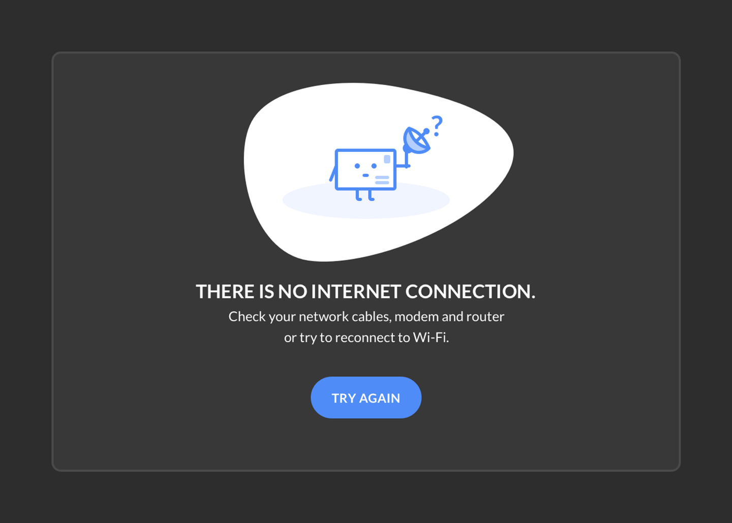
I also tried changing the icon colors. I inverted the design, colouring the outline white instead of blue and the body blue instead of white. I hoped that, by increasing the contrast between outline and background, the icon would become bolder and self-sufficient; instead, it was shaped like a ghost and became even harder to recognise.
 Changing the icons colours
At this point in the project, we still had a few other UI issues in which design elements remained on a white background and, as most of the icons were placed on a card-like design, I considered just leaving those areas white as well.
 Leaving the card white
However, the farther we progressed in the design, the more we darkened those white components. We finally reached a point where character icons on a white background didn’t work anymore.
I looked into the matter once again and quickly realised that there was a problem with the light blue, oval drop shadow. On a white background, this shape is darker than that background and therefore works as shadow or base that the icon can stand on. This helps to position it within the layout. On dark background, on the other hand, this light blue area is not recognisable as a shadow or base element anymore – it looked more like the icon was floating through space on a blue surfboard. I started to experiment by darkening the oval shape’s blue and grey shades. I eventually found that a slightly lighter grey than the background did the trick, turning this element into a base element again.
 Solution: grey oval
With this modification, I was able to successfully place all character icons on a dark background. I’m still not 100% happy with it, though. Although a few icons still feel off, so far, I couldn’t say with certainty why that is. Maybe I will stumble on an even better solution at some point in the future.
A dark theme for Gmail’s UI
Gmail has been offering different background themes for their UI for quite some time. I hoped we would find an appropriate dark theme among their background choices that we could use to turn Gmail’s UI dark as well. To my surprise, there was only one dark theme available. When I added it to one of my first mock-ups, it didn’t fit well with Mailplane’s dark version: Gmail uses nearly 100% black for their background, which is too far away form the dark greys I use for Mailplane. The two didn’t go together, so we decided early on to leave Gmail white.
Thanks to this initial mock-up, however, engineering never forgot about the idea. They eventually came up with a solution to turn Gmail’s UI dark and match it with the grey shades we use for Mailplane. Now, Mailplane comes with a complete dark mode on default. If necessary, there is even an option to turn Gmail’s UI back to white. (Check under ‘Style’ within ‘Preferences’)
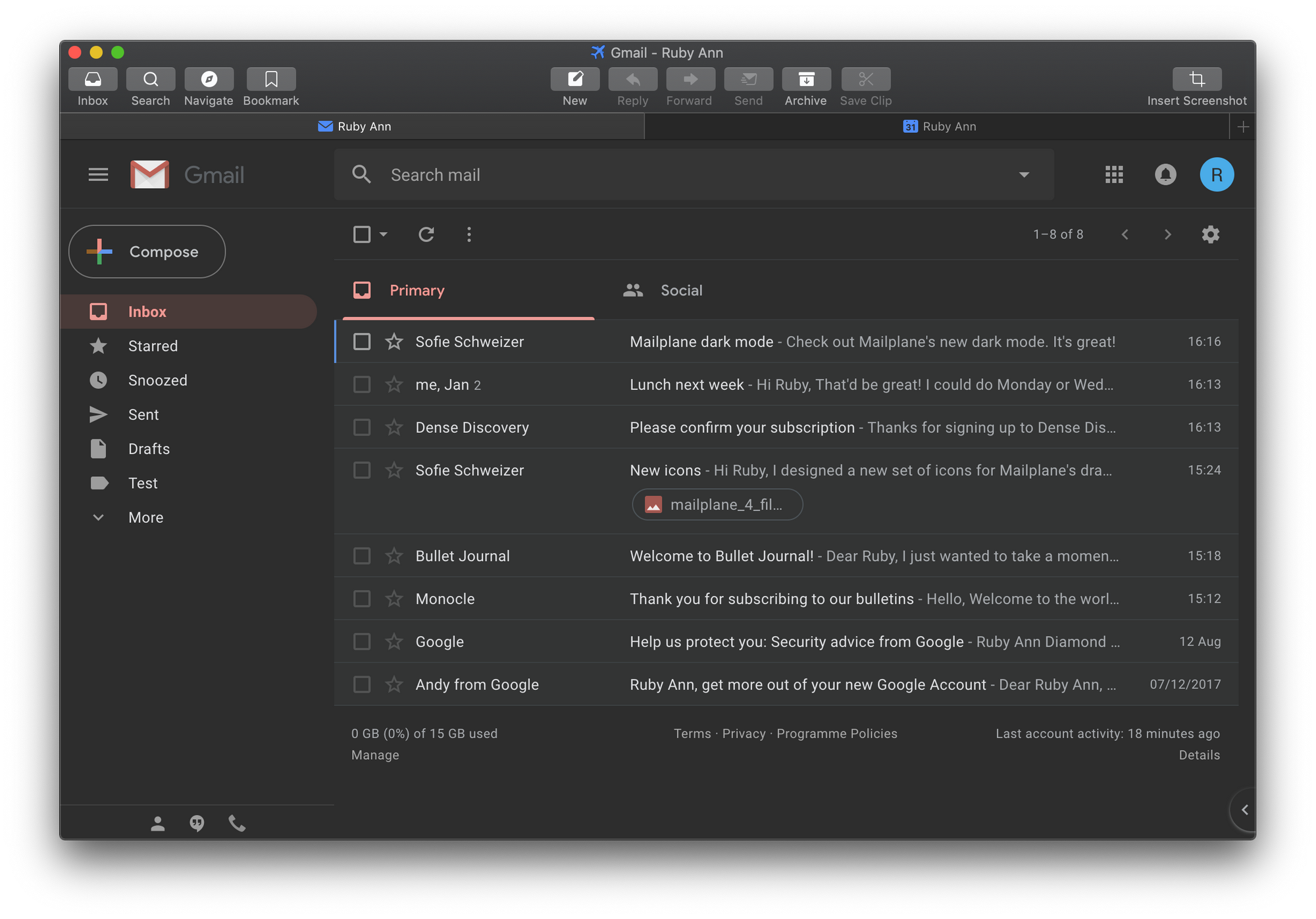 Mailplane dark Gmail UI
After spending several weeks in dark mode, it really grew on me. I’m currently a much bigger fan of Mailplane’s dark mode than its light counterpart. So, for everyone who is interested, I can recommend giving it a try! Just beware – the dark side is powerful.